An interactive version of the model can be accessed here: Access the Model
There has been extensive discussion in the media about how scientists are modeling the progression of the COVID-19 virus. While many of the descriptions of the ‘curve’ of infections from leading authorities have been well articulated, some of the media graphs showing historic exponential growth can be misleading and have added to the fear and uncertainty surrounding this horrific pandemic.
Our team has been following the daily data updates closely and we have created what I will call a ‘demonstration model’ that illustrates how these distribution-based models are created. I will stress that these projections should serve as an illustration of how the experts predict how incident counts will follow a statistical curve. It is based solely on curve fitting and does not consider differences in localized responses to the epidemic, quality and capacity of healthcare or the effectiveness of social distancing. Some of these factors are naturally reflected in the arc of the data, but historic results are not a clear nor deterministic prediction of future outcomes, especially given the delays in testing.
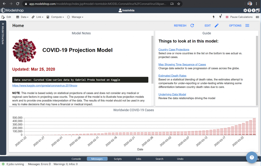
Model assumptions
The primary assumption that drives the model is that the curve of new cases will roughly follow a Gaussian (normal) distribution – what is described in the media as the ‘bell curve’ during growth of the outbreak, then follow a longer decay of new cases roughly modeled as a Gamma curve. The Alpha and Beta (Shape and Scale) of the Gamma curve depend on how effective the containment is for a given country.
Countries such as China and South Korea that have gone through the cycle earlier seem to bear this out, but we continue to speak with data scientists who feel the curve has a skew that may be better represented by other distributions such as a Poisson or multi-variate normal.
Other assumptions include the fact that case reporting appears to be ‘lumpy’, so a time-series filter has been applied to dampen day to day changes in reported case counts.
For the purposes of this model, we have fit the Gaussian growth from the data and projected the Gamma decay based on what we’re seeing so far from Italy. Note that China and South Korea Gamma curves are much faster (more effective) than what we’re modeling. We will update the model as we learn more and will load new daily data over the next few weeks.
Model features
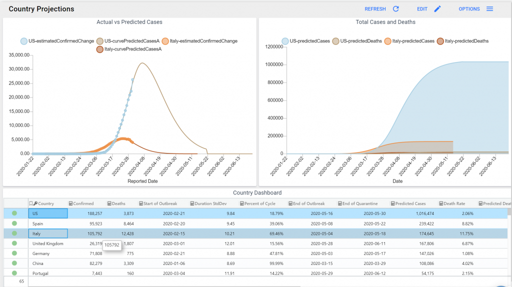
The Country Case Projections dashboard allows you to select one or more countries and view the historic and predicted curve of the disease.
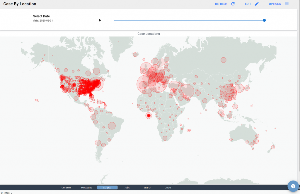
For a time based perspective, you can view the Map Showing Time Sequence of Cases across the globe.
If you are interested in how the model is created, please take a look at the Underlying Data Model.
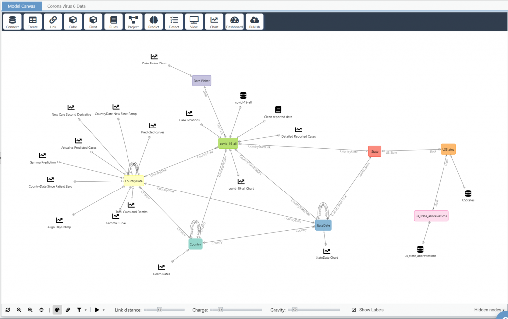
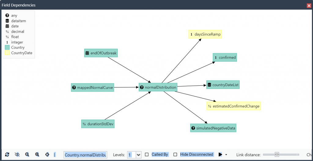
You can also hover on any calculated column and see the logic behind the model, or select Manage->Dependencies to see a directed graph of all the calculations in the model.
Insights from the model
As we’ve stated above, this illustration model is for demonstration purposes only. There are teams of scientists at the CDC and other qualified institutions doing this type of modeling with much greater scientific accuracy. We are publishing this in an effort to help spur conversation and awareness around statistical modeling and how important it is to our society. Despite this model being non-scientific, there are a few insights we can draw from the data.
First, looking at the cyclical nature of the pandemic in China and South Korea is reassuring. There is an end to this even though the US charts currently growing exponentially offer little hope. We have just reached the inflection point where the new cases will first stop accelerating (the Gaussian inflection point), and then our case count per day will stop growing (the top of the curve). There is hope around the corner.
Second, the virus cycle seems to be running with a peak around day 25 after the first cluster of cases with a standard deviation of around 10 days. If you look at a Gaussian distribution, that means that the number of new cases should begin to decrease around day 25 (assuming -2.5 sigma represents the beginning of the outbreak) and should become a comparatively minimal amount after around day 50 (+2.5 sigma). This is much more encouraging, in my mind, than some of the 9+ month projections given in the media. We do see a ‘bounce’ factor in a couple of the earlier countries, showing that we need to be diligent even after cases subside.
What it means for the US
I understand that the White House has recently given guidance that we can expect COVID-19 deaths to reach over 100k. That is a horrific number and I certainly hope that is not the case. While this model is meant to be a demonstration, some of the insights are realistic, and the outlook from the model is not quite as grim. I will explain my thinking below, but I invite others to explore the online model directly and draw their own conclusions.
First of all, almost every country has followed a skewed normal distribution of new case counts that seems to have a standard deviation of around 10 days (which means the bulk of the new cases show up in a 2 sigma (2x standard deviation) band around the apex, or around 4 weeks.
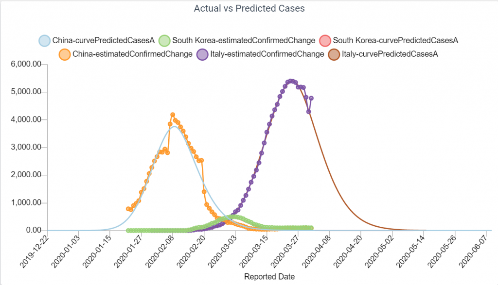
I see this as a natural response timing of a society incubating, taking the threat seriously and responding with social distancing. South Korea and China were very aggressive about containment, and as a result their Gamma decay curve was steep (Beta~3.5). Italy was less aggressive (Beta shaping up at around 5). Early indication is that the US is following a similar curve.
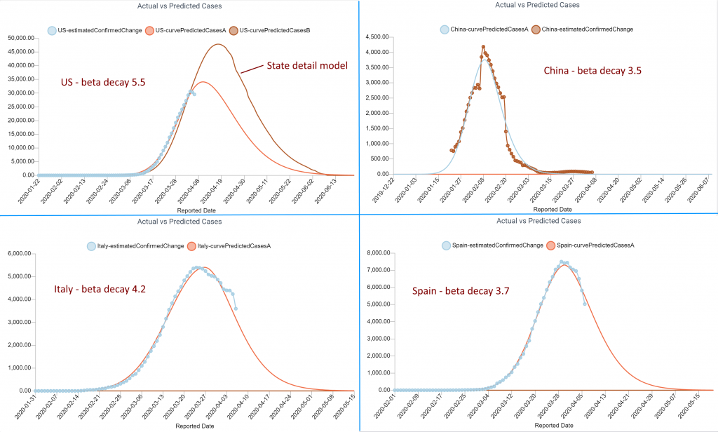
We can see that the acceleration has started to slow as of data from 4/1 (this model is based on the Johns Hopkins dataset). That shift in acceleration, which is an indicator that we have passed the inflection point of the Gaussian rise, can also be seen in the second derivative of reported cases.
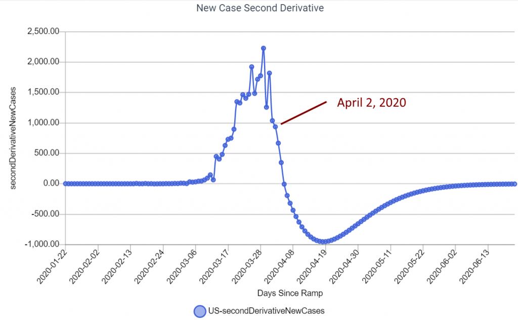
If this trend holds true, I feel we are getting close to turning the corner (zero on the graph above, or the apex where the number of new cases daily is less than the day before). The current model is predicting that will be the second week of April. Even if we’re close to that, and the Gamma decay in cases is a conservative 6.0 (worse than Italy), the model is predicting far less than the latest White House models – I am still working to figure out where that may be too conservative. I am sure reality will fall somewhere in between. Note that any case predictions in the model reflect the initial cycle of the pandemic and do not represent the ongoing impact of the disease as we work to maintain it. Similar to the seasonal Flu, COVID-19 may be responsible for 10s of thousands of deaths a year on an ongoing basis.
Conclusion
The goal of sharing this model is not to try to second-guess the incredibly talented scientists at the CDC and their supporting science institutions. The models they are building are significantly more sophisticated and include more detailed bottom-up predictive assumptions. The reason we’ve published the model is because it helps for everyone to become more familiar with how models like this work. Models now run our world much more than most people realize.
There is a second goal in sharing this model. It is to offer a bit of hope amid some scary projections this last week. Statistically, I think we are starting to see the impact of the incredible cultural response we’ve had in the US. I’ve worked closely with the data, including state level case counts, and the problem with the latest more pessimistic models is that they assume every population area in the United States will go through a similar incubation, threat recognition and response cycle as NY/NJ. While some areas are responding more quickly than others, we are responding together as a nation. My assumption is that we will follow a similar cycle as China, South Korea and even Italy. Our spike will be higher because we waited a couple of weeks too long to respond, but now that we are responding I hope and believe that our abatement cycle will be similar to those earlier countries. It also seems our death rates will be significantly lower.
I do have faith that we will all get through this pandemic and we will be a stronger society as we emerge from it. That offers little comfort for those directly impacted and my thoughts and prayers go out to you if you have been personally affected by the virus.
If you have feedback or ideas about how we can improve the model we would love to hear from you.
Special Thanks: I’d like to thank Bill Watson, a modeler from San Diego, for his insights in developing this model. Much of the curve fitting assumptions come from work he has done on this dataset.
Tom Tobin is Modelshop’s CEO and Founder. He has been building automated modeling solutions in the credit and fraud space for over 25 years as a technology leader at FICO, Fiserv, Oracle and HP.
